Saturday, August 9, 2008

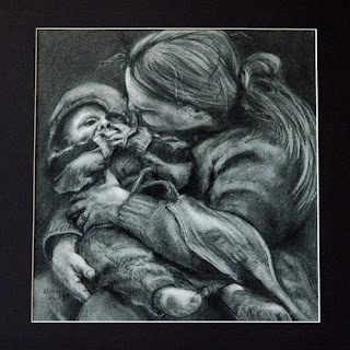
A Mother's Love....


"A Mother's Love" or "A Precious Moment"
(titles are difficult for me!)
charcoal drawing on Rives BFK, image is ~15 x 15 inch, matted size is 18 x18 inch
copyright MaryAnn Cleary

Well, this is the final version of a drawing that was posted on my other blog a couple of days ago. I tend to fuss with drawings until I feel that I have all the bugs worked out...especially in charcoal. I did leave it sit for a couple of days and I did send it off to my sweet daughter as she could look at it with fresh eyes. She also is not fearful of saying how it is...so off with the claw hand and there was an area that bothered us both...so fixed.

When doing a drawing like this I really like to put it on an easel, but this one I had on my drawing table. It is difficult to stand back and take a look without standing on a chair and trying not to fall. Eventually, I did pull it off the table and mount it to a board so that I could see it and finish it on an easel. What a difference!!!

If anyone would like a drawing similar of a loved one in their life, let me know. Of course there usually is money involved in doing something like this. I like to take photos, do sketches in real life, do a preliminary drawing and then work on the final piece. It takes considerable time, but the end results is usually worth it.

Enjoy!
Tuesday, July 29, 2008

Is Color That Powerful???


Color can be a very powerful means of subconsciously getting folks to view or see a painting, a way to invoke emotion and a means of sending a message.

In paintings, color can depict moodiness or grab the eye of the viewer to take a closer look. Red has a means of popping out to the front in a painting. Some paintings have a calming effect on the viewer. Does color play a part in it? Definitely.

As I do my daily paintings , I will take a more conscience look at color. Those used for the backgrounds. Those colors used for emphasis. The color used for the overall color theme. All are important in the overall composition of a painting.

Why does a viewer like a painting? Is it color? Is it the composition? Is it the subject? To me, some paintings just seem to be "magical" and many times I am pretty clueless as to why.

What paintings do you like and why? Do you know? I would love to hear other comments on this.

Saturday, July 26, 2008

Putting Together a Business Card or A Little Marketing


This past week I finally put together a decent business card. Initially, the plan was to go get some of the perforated sheets and make my own on my printer. Well, after attending a entrepreneur workshop, that is the last thing a person should do. Giving out business cards with tiny perforated edges and ones that look like a person did them on their home computer is well.... not too professional looking..... Well, I thought that it was a good idea and a great way to save some money. Back to the drawing board.

Off to Office Max I went to check out the kiosk for making cards, labels, envelopes, brochures, letterhead... One step at a time for this girl, please. I had a couple of options in ordering cards: use a template and fill in the blanks (a very basic one), pick one of their photos and do the same or use one of my photos, and thirdly, design my own. I did check out the designs that were available, but nothing seemed to "sing" to me. So back home I went to design my own.

If one is going to design their own business card, make sure you get the measurements required for designing it. Office Max had a bleed measurement and a cut measurement. On top of all that, when I got their and downloaded my card into the kiosk, there was an extra mm (millimeter) whacked off that came pretty darn close to cutting off the bottom line. I did not feel like going home and moving the line up to be "real" safe. I really wanted that line as close to the bottom as possible.


In the workshop, the leader stated to "please do not use those perforated cards. If a person wants to present a professional image, get ones where the edges are cut smooth and on a decent card stock and nice print". I not only opted for color, but a glossy one. I must admit that I could never make these look like this on my home computer with my regular ink jet printer. (By the way, I really did not want to waste archival ink from my Epson printer on business cards.)

I also opted to design my own card. I used one of my photos as the background. This is an actual photo that I took on my front porch of a dragonfly resting in the hanging basket with a fushia. I love how the rest of the photo is out of focus, but the dragonfly is center stage. In Native American culture, the dragonfly has special meaning: longevity, richness, prosperity, infinity, wisdom, power and fiery. All things that are good omens for one starting a business as an artist and I need all the help that I can get.

Besides, dragonflies love to eat mosquitoes and when a person lives where I do, along side a river, there can never be too many dragonflies in one's life.

Next maybe a brochure.....one step at a time.

What are other's experiences with business cards and other promotional literature, such as, brochures? Is it worth it? Comments are welcomed.

Tuesday, July 22, 2008

An Update on Some Papers


This is a photo of the print done on Stonehenge paper that has a grey tone to it.
This was my first attempt.
The paper is large at 15.5" x 22"


After getting over the fear of setting up my printer, I did do some printing using a variety of papers. There are still more that I want to try and in a more organized fashion instead of "just wanting to see what it looks like."

Since I am an avid photographer as well as being a fine artist, I did print out some of my photographs as well as some replicas of my artwork.


Both of these were done on the Ceramic Gloss paper (they look much better in real life vs. my rather crappy photos)

The papers that I have tried thus far are:
  • Epson Ultra Premium Photo Paper Luster
  • Somerset velvet
  • Stonehenge (artist print paper)
  • InkJetArt Micro Ceramic Gloss Plus


  • The one on the left is the Epson Luster photo paper and the one on the right is the Somerset Velvet
  • Notice the color differences (this has to do with how the paper absorbs the ink)
  • Definitely more experimentationis needed with the Somerset Velvet

What I have learned so far:
  • the Epson Luster paper is one of my favorites, especially for photos
    • it has a wonderful matte finish
    • the prints look fabulous
  • using the Somerset velvet can be tricky
    • this paper should not use the highest dpi when printing, e.g., I tried printing one of my mandala prints that had a dark green background and the background ended up being almost black. I used the highest dpi for the printer and this was a mistake.
    • the results are best for light colored artworks, such as watercolors or some of my manipulated photos that have a watercolor feel to them
    • more work needs to be done, but I really like this paper as it is thick and luscious like a nice artist's paper.
  • the micro ceramic gloss plus paper is very glossy, it does well for those photo shots where one wants a glossy print
    • the surface is very smooth and does not have a texture to it like the Epson matte paper
    • it did make nice mandala prints

These are small prints done on the Epson Luster paper of two watercolors and a small oil


Papers yet to try:

  • a couple of sample packs, one from Hahnemuhle
  • one that is an assortment of smooth fine are papers
  • more of my art papers, such as the toned Canson papers
  • Epson Velvet Fine Art paper
The learning curve for this printer is going to take some time, but one cannot be fearful of making mistakes. After all, that is how a person learns. In the meantime, I plan on doing a little more research in what parameters to use with which paper. There is a strong support team out there. One just needs to reach out and use it. Now that I have more knowledge of the workings of this printer, I will have a better feel to search out what I am looking for.

So far, I really like it. I am also realizing papers can make a difference. Look for more on what I find out.

If anyone else has questions or has experiences they would like to share, I would love to hear from you. Please feel free to leave a comment.

Thanks for stopping by ~ MaryAnn

All images are copyright 2008 MaryAnn Cleary.

Wednesday, July 16, 2008

Researching Printers...Got an Epson


Peonies
copyright 2008 MaryAnn Cleary
(this will be one of my test prints)

One thing that I really wanted to do was be able to have control over making prints. The type of ink and paper are important to me as I wanted something that would last. After doing much research, I finally settled upon an Epson Stylus Pro 3800. Not only did I want to print quality color prints for photographs and selected pieces of my artwork, but I wanted to have a high quality black and white print. Everything that I read suggested that there would be no tinges of blue and it would be a high quality print that actually looked black and white.

Well, my printer has arrived and I have played around with it a little. It took me a day just to set it up....well a couple of hours. I did use various types of paper just to see what would happen. I also did a black and white print of one of my charcoal drawings....wow. It is nice. One reason for getting this printer has to do with the inks used. They are pigmented not just dyes. This adds to the longevity of a print. Of course, one is not supposed to hang it (or a painting) in direct sunlight unless one wants the thing to fade....it will print or painting.

Tomorrow I plan on printing out more since I purchased a variety of high quality papers to test. I want to know what it will do. I will let everyone know what my favorites are and what few I tested.

One reason for getting a printer is that I actually have ordered giclee prints in the past from an outside source. However, one thing that really bothered me and I found troublesome was the borders...1/8 inch just didn't seem sufficient to me. There is no room to sign your name and barely enough to be able to matt it. I needed control over the process.

The size that I can print is up 17 inches wide. This is sufficient for now. If this works out, I may opt to get a better or bigger printer, but for now this one is awesome and will fit my needs just fine. More on the actually printing tomorrow or the next day. I want to do some photos and I also have a few paintings and charcoals to print up.

Stay tune for more.....

Monday, July 14, 2008

The Orphan Works Bill....

Below is information on the orphan works bill. If you are an artist, this bill will require us to do so much more work to protect what is rightfully ours. This bill will actually has the potential to take rights away from artists as well as add additional expense to protect what is rightfully ours.

Recently, I read a comment that we now live in the age of "napsters" or those who feel that all art forms should be obtained for FREE.

Take a moment and read the facts about the potential harm of this bill and then write your Congress person at Legislative Action Center.

MaryAnn Cleary
Artist


FROM THE ILLUSTRATORS' PARTNERSHIP


We've had word that the House Judiciary Committee may mark-up the Orphan Works Bill this week. This is the session where Committee Members will propose, accept and reject amendments to H.R. 5889. After markup, the bill could be reported out of the House Committee and go to the floor for a vote.

We've submitted several critical amendments for consideration: These would limit the scope of the bill to affect only true orphaned work. Unless such amendments are adopted, we believe the bill should not be reported out until its impact on small businesses can be determined. Here's our summary of the issues at stake in the House version of this bill:

Q What is the Orphan Works Act?
A: A proposed amendment to copyright law that would impose a radically new business model on the licensing of copyrighted work.

Q: How would it do that?
A: It would force all creators to digitize their life's work and hand it over to privately-owned commercial databases or see it exposed to widespread infringement by anyone, for any purpose, however commercial or distasteful.

Q: How would it hurt me if I didn't register my work?
A: The bill would let infringers rely on for-profit registries to search for your work. If your work is not in the databases, it's a potential "orphan."

Q: What about my unpublished work?
A: The bill would apply to any work, from professional paintings to family snapshots, home videos, etc., including published and unpublished work and any work ever placed on the internet.

Q: How would these databases work?
A: No one has yet unveiled a business plan, but we suspect they'd operate like stock houses, promoting themselves as one-stop shopping centers for licensing art. If you've registered your work with them, they'll probably charge you maintenance fees and commissions for clearing your work. If you're a publisher or art director, they'll probably charge you search fees. If you're an infringer, they'll probably charge you a search fee and issue orphan certificates for any unregistered work you'd like to infringe. We assume different registries may have different terms, and any start-up terms will of course be subject to change.

Q: How will the bill affect the market for commissioned work?
A: It will be a gold mine for opportunists, favoring giant image banks over working artists. Some companies will probably sell access to orphans as royalty-free work -- or they'll harvest orphans and bundle them for sale as clip art. Other companies can harvest orphans, alter them slightly to make "derivative works" and register the derivatives as their own copyrighted product. Freelancers would then be forced to compete against their own lost art - and that of their colleagues - for the new commissions they need to make a living.

Q: But the bill's sponsors say the bill is just a small adjustment to copyright law.
A: No, it's actually a reversal of copyright law. It presumes that the public is entitled to use your work as a primary right and that it's your legal obligation to make your work available.

Q: But isn't the House bill an improvement over the Senate version?
A: Only for those who intend to operate commercial databases. These registries will exist to make money. To make money, they'll have to do a lively business in clearing work for infringements. That means making their databases infringer-friendly.

Q: But isn't the House bill better because it requires an infringer to file a Notice of Use, documenting their intent to infringe?
A: The House bill creates a very low threshold for infringers to meet. They'd only have to file a text description (not the image itself) of the work they want to infringe, plus information about their search and any ownership information they've found.

Q: But won't that let artists consult the archive to see if their work has been infringed?
A: No, as currently written, the Notice of Use is a dark archive, which means you won't have access to it. If someone infringes your work and has filed a Notice of Use, you wouldn't know about it.

Q: Then how would I know if my work is in the Dark Archive?
A: You wouldn't, unless a.) you discover you've been infringed; b.) you sue the infringer in federal court; c.) the infringer asserts an Orphan Works defense. Then you can file a request to see if the infringer has filed a Notice of Use to infringe your work.

Q: Then what good does it do me for the infringer to file a Notice of Use?
A: It's of no probative value to you at all unless you go to court. And if you do, you'd better be sure of winning because otherwise, without the possibility of statutory damages and attorneys' fees, it will be too expensive for you to sue. If the Notice of Use helps anyone, it actually helps the infringer: it lets him prove in court that he followed the prescribed protocol to "legally" infringe your work.

Q: Then shouldn't we ask Congress to change the Dark Archive to an open one?
A: This would still place an impossible burden on you. Can you imagine routinely slogging through a "lost and found" containing millions of text descriptions of works to see if something sounds like one of the hundreds or thousands of illustrations you may have done?

Q: So should the infringement archive be changed to display images rather than text descriptions?
A: If so, you'd have a come-and-get-it archive for new infringers to exploit works that have already been identified as orphans by previous infringers.

Q: The bill's sponsors say the House version includes specific instructions on the requirements for diligent searches.

A: No, read the bill. It's full of ambiguous terms like "reasonable" and "diligent" that can only be decided by courts on a case-by-case basis. That could take a decade of expensive lawsuits and appeals. How many millions of copyrights will be orphaned before we learn how the courts ultimately define these vague terms?

Q: Then what can we do to improve this bill?
A: We don't believe the bill can be patched up to mitigate its harm to creators. The Orphan Works matter should be solved with carefully defined expansions of fair use to permit reproduction by libraries and archives, or for family photo restoration and duplication. Narrow exceptions like these would also meet the needs of other orphan works usage without violating artists' rights as defined by the 1976 Copyright Act, The Berne Convention and Article 13 of the TRIPs Agreement. These copyright-related international trade treaties are not just a matter of law. They codify longstanding business practices that have passed the test of time.

Q: What can we do now to oppose this legislation?
A: If you're opposed to the House bill in its current form, contact members of the full House Judiciary Committee. Ask them to adopt our amendments limiting the scope of the bill to affect only true orphaned work. Tomorrow, we'll email you a short basic letter which you may use as a template.


--Brad Holland and Cynthia Turner, for the Board of the Illustrators' Partnership

Over 60 organizations are united in opposing this bill in its current form. Illustrators, photographers, fine artists, songwriters, musicians, and countless licensing firms all believe this bill will harm their small businesses.

Don't Let Congress Orphan Your Work

To use the Orphan Works Opposition Website just go to this link:

http://capwiz.com/illustratorspartnership/home/

Put in your zip code and follow the instructions. Your letters will be addressed and sent automatically. It takes less than 2 minutes to fight for your copyright.

If you received our mail as a forwarded message, and wish to be added to our mailing list, email us at: illustratorspartnership@cnymail.com Place "Add Name" in the subject line, and provide your name and the email address you want used in the message area.

Thursday, July 3, 2008

Where is the Niche??


The Tree Faeries
original oil painting on canvas board, 9 x 12 inch, unframed
copyright 2008 MaryAnn Cleary


What is a niche? According to the dictionary, a niche can be many different things: a recess on the wall, a person who has found employment that fits his or her needs for the speciality that the person may work in, or a niche can be a specialized market.

The past few months I have been struggling with figuring out what my niche is with my artwork. What drives the passion? Where is a place where I can excel and do something that is not common place? I have always had a love of drawing or painting children and especially mothers with their children. There is a special bond. My greatest enjoyment comes from painting the little ones with their expressiveness and mannerisms so pure.

After finishing The Tree Faeries, I realized that I really enjoyed this painting. Don't get me wrong, I enjoy painting and drawing always. However, sometimes there are those that drive the passion and almost set the world on afire with the intensity. This was one of those paintings. All I could think about, all I could do was this painting. I loved the work involved with creating it and guess what, it came easily. It just clicked.

My small daily paintings are fun to do, but I view them more as an exercise for honing my skills as an artist. Sometimes they click, sometimes I feel like they require a lot of effort...but I am always learning.

So what is my niche? Painting the portrait of the child, or a mother and child in a natural and capturing way.

Currently, I am working on a charcoal of my daughter and her son. Look for the finished drawing in a couple of days. I promise to post it.

So what is your niche? For any who are interested in portraiture, Making a Mark is starting an awesome resource.