Saturday, March 29, 2008
Sunflower Sketch....
size: 9"x11"
copyright MaryAnn Cleary
the photo on the left is the original, the one on the right is using the Lucis filter
Reference photos taken by MaryAnn Cleary copyright
I not only took the photo, but then I also used some software that manipulates the photo to bring out the dark areas. It is an Lucis Art Filter that I added to my Photoshop Elements program. Sometimes, when a person thinks that a photo has totally been lost due to being underexposed, this software can bring out the details. It can also be used to give the photograph some fun effects.
In this post I wanted to show how I sometimes uses photos for my drawings. I am not one who does an exact replicate of the photo as I feel that photos should be used as a reference tool. If a person wants realism, then why draw...take a photograph. To get this photo, I also had to take around ten to twelve shots with only one or two really being able to be used. As Making a Mark noted today, it definitely does take several shots to get a really usable one. I thought it was my poor photography skills, but it is nice to know that even a professional photographer takes numerous photos before getting a good one.
Sunday, March 16, 2008
The White Orchid
original drawing with conte on toned paper
size: 8.5" x 10.5"
copyright MaryAnn Cleary
Thursday, March 13, 2008
A Light Box..
Today I found a great link with a step-by-step procedure for making an inexpensive light box out of PVC and a white sheet. Lately, I have been trying to get the light just right on my oil paintings so that the light does not bounce off those tiny spots of woven fabric beneath the painting. Some canvas types are much worse than others. This light tent/box should definitely help with taking the glare off. It can also be used for taking photos of other items where a person needs a crisp and clean photo.
Enjoy! MaryAnn
P.S. I am going to try to make one and I will follow up with photos and results.
Saturday, March 8, 2008
Attachments....

Attachments
colored pencil on illustration board, 12.5" x 19.5"
copyright MaryAnn Cleary
As I read through Stanfield's book, I'd rather be in the studio, I am realizing that the marketing portion of my art will take considerable time and commitment. I have made the decision to leave the corporate world behind me and to venture to this new, but familiar, frontier - at least the art part, not the marketing side. I believe in me. My family believes in me. According to Stanfield, it is important to get organized, stop wasting energy, so that there is more time for the creative mind. "An effective routine is built on knowing what you have to do and when you have to do the things you know you have to do!" (p.28, Stanfield).
Right now I have a lower level room in my house that is filled with my "stuff" from China. I have procrastinated unpacking and getting those things put away. "It is too cold. I need to paint. I have no place to put it...." The list goes on. That room will make a perfect studio. I have a wonderful view of the river and the light is perfect with the northern exposure. So what is stopping me? It means commitment...commitment to doing my art daily, to setting up a routine, to doing what I love. However, I also find myself fearful. I fear that I won't be able to make my house payment or that I will need another job or that who in their right mind would decide to leave such a good job....my "monkey mind" tries to take over and convince me not to take the risk. I undermine myself.
So today, I will make my list, begin to get things into order, and start on being an artist. I believe in me.
MaryAnn
Stanfield, A., I rather be in the studio!, Pentas Press, Colorado, (2008).
Thursday, March 6, 2008
Where to Next?
acrylic 16"x16"
an early work done after Zemsky-Hines workship
copyright MaryAnn Cleary
For now, I will continue doing my daily paintings in oil. I love using the small gallery wrapped canvases as I can paint part of the painting on the side to draw the viewer into the painting. I also like the quick and more instantaneous results (good or bad). Other media that I enjoy working with are conte and charcoal together on a toned paper as well as watercolor and colored pencils. When I use either of the last two media, I use many layers to build the values and colors that are needed. A work can take many, many hours to complete. However, I like the flexibility of using them wherever you are, especially the pencils.
By the way, Julie is my daughter. She now has her own little one, Nico, and lives with her partner in Montana not far from Big Timber.
Please leave comments as they would be appreciated. I would like to know how others figure out their style and who they are as artists.
MaryAnn
Tuesday, March 4, 2008
A New Book Came in the Mail....
A few days earlier as I was searching for information on the business side of art, I ran into a promo for the book called "I'd Rather Be in the Studio" by Alyson B. Stanfield. I had been to this site before, read about the information and since the book had been published, I decided to order it. It showed up nicely packaged and within a couple of days. I must admit after glancing through the book, it is packed with a lot of excellent information. Most of the information, I already knew about. However, Alyson takes it one step further so that it seems to make it easier and also so that you stand out from the crowd.
As I get through this book and the recommendations, I can pass on what I feel is working for me. Areas where I know that I need work are managing my time, prioritizing, and wondering if I will every accomplish everything on my list. All this is covered. I am realizing that all of this is going to take time, but by taking small pieces everyday, I know that some day I will reach the "tipping point"......hopefully with a lot of work!
For now, I also need to focus on who I am as an artist. Sometimes I feel like I am spinning my wheels trying to figure that part out. I love to paint and draw, but what is my style and who am I. That seems to be still evolving....or is it something that continues to evolve as one progresses.
Today as I grabbed my little list notebook, and I was looking at a small pot of baby daffodils in my kitchen, I did a quick sketch. Something clicked inside me. I had lost some of my spontaneity in my drawings. One can work from real life or photos, but it is important to draw, draw, draw. So I will carry a little sketch book with me, a pencil or some type of drawing tool and draw quick sketches of my environment. One can look at things and think, "oh, that would be fun to paint", but without doing some sketches a person may miss out on an opportunity for a great painting.
So here is my little sketch from my "things to do notebook" that I will use for reference for my "painting a day". It is simple, but I like the composition. Next time I will grab my sketchbook, but I was trying to be spontaneous today......
Saturday, March 1, 2008
A Little Drawing.....
TOOLS USED
- a piece of toned Canson Mi Tientes paper smooth side
- erasers...all types and varieties (kneaded, red, white, pencil....try them all to find what works for you)
- charcoal pencils
- conte sticks (black, sanguine, white)
- a chamois (small piece of tanned leather)
- a small cotton cloth
- an erasing shield
- smudge stick
- tape, newsprint and a drawing board
- photo or draw from life....(I like using charcoal and conte to sketch from life)
Here are some of the things that I use for this type of drawing technique
The PROCESS......Stage 3: Above one can see the progression of the drawing. The conte is blended, charcoal is used in the dark value areas and then an eraser is used to pull out the lighter areas. Using an eraser is much like drawing.

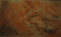
Nico's Toes...not the final version..
Stage 5: This was supposed to be the final drawing with my name signed to it. However, I really did not like it at all so I set it aside for a day. After looking at it for a day, I knew that I hated the end drawing so I ended up redoing it. I erased a lot of the dark areas out with both the red eraser and one of those soft, big ones. I then added more of a sanguine color and redrew some areas. My mistake with this one was probably using charcoal to do the initial drawing instead of a sanguine conte. By using the charcoal, the dark areas were just too overworked. The drawing at the beginning of the post is how I am going to leave it. (I may soften the highlights at the top, but for now I will leave it as is.)
This really wasn't one of my better attempts, but I thought that it would be helpful to see the process. Even if one goofs up, it still can be corrected. Next time I will use a lot less charcoal and start the drawing using the mid-tone sanguine conte and then use the charcoal and the white for the light and dark areas. It is very important to save the white for the very end. There have been times when I just could not resist putting it on the paper. What happens then is that the white gets muddy looking, especially if a person tries to work it in with other colors.
When the drawing is finally finished, I use my chop (this is a stone with a mark carved into the bottom of it) from when I lived in China, and then also put my signature on it. With this drawing, the chop actually showed up better when I erased some of the charcoal areas - when I decided that I hated the drawing. In the almost final drawing, I did stamp the chop onto the drawing, but it did not show up too well. In a future post, I can show some photos of my chop (I did get several), but one is special as it was done by an artist who was very good at it. He went to school to learn calligraphy and was excellent.
Hope this process was interesting...
MaryAnn


