Saturday, August 9, 2008

A Mother's Love....


"A Mother's Love" or "A Precious Moment"
(titles are difficult for me!)
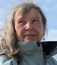
charcoal drawing on Rives BFK, image is ~15 x 15 inch, matted size is 18 x18 inch
copyright MaryAnn Cleary

Well, this is the final version of a drawing that was posted on my other blog a couple of days ago. I tend to fuss with drawings until I feel that I have all the bugs worked out...especially in charcoal. I did leave it sit for a couple of days and I did send it off to my sweet daughter as she could look at it with fresh eyes. She also is not fearful of saying how it is...so off with the claw hand and there was an area that bothered us both...so fixed.

When doing a drawing like this I really like to put it on an easel, but this one I had on my drawing table. It is difficult to stand back and take a look without standing on a chair and trying not to fall. Eventually, I did pull it off the table and mount it to a board so that I could see it and finish it on an easel. What a difference!!!

If anyone would like a drawing similar of a loved one in their life, let me know. Of course there usually is money involved in doing something like this. I like to take photos, do sketches in real life, do a preliminary drawing and then work on the final piece. It takes considerable time, but the end results is usually worth it.

Enjoy!

Tuesday, July 29, 2008

Is Color That Powerful???


Color can be a very powerful means of subconsciously getting folks to view or see a painting, a way to invoke emotion and a means of sending a message.

In paintings, color can depict moodiness or grab the eye of the viewer to take a closer look. Red has a means of popping out to the front in a painting. Some paintings have a calming effect on the viewer. Does color play a part in it? Definitely.

As I do my daily paintings , I will take a more conscience look at color. Those used for the backgrounds. Those colors used for emphasis. The color used for the overall color theme. All are important in the overall composition of a painting.

Why does a viewer like a painting? Is it color? Is it the composition? Is it the subject? To me, some paintings just seem to be "magical" and many times I am pretty clueless as to why.

What paintings do you like and why? Do you know? I would love to hear other comments on this.

Saturday, July 26, 2008

Putting Together a Business Card or A Little Marketing


This past week I finally put together a decent business card. Initially, the plan was to go get some of the perforated sheets and make my own on my printer. Well, after attending a entrepreneur workshop, that is the last thing a person should do. Giving out business cards with tiny perforated edges and ones that look like a person did them on their home computer is well.... not too professional looking..... Well, I thought that it was a good idea and a great way to save some money. Back to the drawing board.

Off to Office Max I went to check out the kiosk for making cards, labels, envelopes, brochures, letterhead... One step at a time for this girl, please. I had a couple of options in ordering cards: use a template and fill in the blanks (a very basic one), pick one of their photos and do the same or use one of my photos, and thirdly, design my own. I did check out the designs that were available, but nothing seemed to "sing" to me. So back home I went to design my own.

If one is going to design their own business card, make sure you get the measurements required for designing it. Office Max had a bleed measurement and a cut measurement. On top of all that, when I got their and downloaded my card into the kiosk, there was an extra mm (millimeter) whacked off that came pretty darn close to cutting off the bottom line. I did not feel like going home and moving the line up to be "real" safe. I really wanted that line as close to the bottom as possible.


In the workshop, the leader stated to "please do not use those perforated cards. If a person wants to present a professional image, get ones where the edges are cut smooth and on a decent card stock and nice print". I not only opted for color, but a glossy one. I must admit that I could never make these look like this on my home computer with my regular ink jet printer. (By the way, I really did not want to waste archival ink from my Epson printer on business cards.)

I also opted to design my own card. I used one of my photos as the background. This is an actual photo that I took on my front porch of a dragonfly resting in the hanging basket with a fushia. I love how the rest of the photo is out of focus, but the dragonfly is center stage. In Native American culture, the dragonfly has special meaning: longevity, richness, prosperity, infinity, wisdom, power and fiery. All things that are good omens for one starting a business as an artist and I need all the help that I can get.

Besides, dragonflies love to eat mosquitoes and when a person lives where I do, along side a river, there can never be too many dragonflies in one's life.

Next maybe a brochure.....one step at a time.

What are other's experiences with business cards and other promotional literature, such as, brochures? Is it worth it? Comments are welcomed.

Tuesday, July 22, 2008

An Update on Some Papers


This is a photo of the print done on Stonehenge paper that has a grey tone to it.
This was my first attempt.
The paper is large at 15.5" x 22"


After getting over the fear of setting up my printer, I did do some printing using a variety of papers. There are still more that I want to try and in a more organized fashion instead of "just wanting to see what it looks like."

Since I am an avid photographer as well as being a fine artist, I did print out some of my photographs as well as some replicas of my artwork.


Both of these were done on the Ceramic Gloss paper (they look much better in real life vs. my rather crappy photos)

The papers that I have tried thus far are:
  • Epson Ultra Premium Photo Paper Luster
  • Somerset velvet
  • Stonehenge (artist print paper)
  • InkJetArt Micro Ceramic Gloss Plus


  • The one on the left is the Epson Luster photo paper and the one on the right is the Somerset Velvet
  • Notice the color differences (this has to do with how the paper absorbs the ink)
  • Definitely more experimentationis needed with the Somerset Velvet

What I have learned so far:
  • the Epson Luster paper is one of my favorites, especially for photos
    • it has a wonderful matte finish
    • the prints look fabulous
  • using the Somerset velvet can be tricky
    • this paper should not use the highest dpi when printing, e.g., I tried printing one of my mandala prints that had a dark green background and the background ended up being almost black. I used the highest dpi for the printer and this was a mistake.
    • the results are best for light colored artworks, such as watercolors or some of my manipulated photos that have a watercolor feel to them
    • more work needs to be done, but I really like this paper as it is thick and luscious like a nice artist's paper.
  • the micro ceramic gloss plus paper is very glossy, it does well for those photo shots where one wants a glossy print
    • the surface is very smooth and does not have a texture to it like the Epson matte paper
    • it did make nice mandala prints

These are small prints done on the Epson Luster paper of two watercolors and a small oil


Papers yet to try:

  • a couple of sample packs, one from Hahnemuhle
  • one that is an assortment of smooth fine are papers
  • more of my art papers, such as the toned Canson papers
  • Epson Velvet Fine Art paper
The learning curve for this printer is going to take some time, but one cannot be fearful of making mistakes. After all, that is how a person learns. In the meantime, I plan on doing a little more research in what parameters to use with which paper. There is a strong support team out there. One just needs to reach out and use it. Now that I have more knowledge of the workings of this printer, I will have a better feel to search out what I am looking for.

So far, I really like it. I am also realizing papers can make a difference. Look for more on what I find out.

If anyone else has questions or has experiences they would like to share, I would love to hear from you. Please feel free to leave a comment.

Thanks for stopping by ~ MaryAnn

All images are copyright 2008 MaryAnn Cleary.

Wednesday, July 16, 2008

Researching Printers...Got an Epson


Peonies
copyright 2008 MaryAnn Cleary
(this will be one of my test prints)

One thing that I really wanted to do was be able to have control over making prints. The type of ink and paper are important to me as I wanted something that would last. After doing much research, I finally settled upon an Epson Stylus Pro 3800. Not only did I want to print quality color prints for photographs and selected pieces of my artwork, but I wanted to have a high quality black and white print. Everything that I read suggested that there would be no tinges of blue and it would be a high quality print that actually looked black and white.

Well, my printer has arrived and I have played around with it a little. It took me a day just to set it up....well a couple of hours. I did use various types of paper just to see what would happen. I also did a black and white print of one of my charcoal drawings....wow. It is nice. One reason for getting this printer has to do with the inks used. They are pigmented not just dyes. This adds to the longevity of a print. Of course, one is not supposed to hang it (or a painting) in direct sunlight unless one wants the thing to fade....it will print or painting.

Tomorrow I plan on printing out more since I purchased a variety of high quality papers to test. I want to know what it will do. I will let everyone know what my favorites are and what few I tested.

One reason for getting a printer is that I actually have ordered giclee prints in the past from an outside source. However, one thing that really bothered me and I found troublesome was the borders...1/8 inch just didn't seem sufficient to me. There is no room to sign your name and barely enough to be able to matt it. I needed control over the process.

The size that I can print is up 17 inches wide. This is sufficient for now. If this works out, I may opt to get a better or bigger printer, but for now this one is awesome and will fit my needs just fine. More on the actually printing tomorrow or the next day. I want to do some photos and I also have a few paintings and charcoals to print up.

Stay tune for more.....

Monday, July 14, 2008

The Orphan Works Bill....

Below is information on the orphan works bill. If you are an artist, this bill will require us to do so much more work to protect what is rightfully ours. This bill will actually has the potential to take rights away from artists as well as add additional expense to protect what is rightfully ours.

Recently, I read a comment that we now live in the age of "napsters" or those who feel that all art forms should be obtained for FREE.

Take a moment and read the facts about the potential harm of this bill and then write your Congress person at Legislative Action Center.

MaryAnn Cleary
Artist


FROM THE ILLUSTRATORS' PARTNERSHIP


We've had word that the House Judiciary Committee may mark-up the Orphan Works Bill this week. This is the session where Committee Members will propose, accept and reject amendments to H.R. 5889. After markup, the bill could be reported out of the House Committee and go to the floor for a vote.

We've submitted several critical amendments for consideration: These would limit the scope of the bill to affect only true orphaned work. Unless such amendments are adopted, we believe the bill should not be reported out until its impact on small businesses can be determined. Here's our summary of the issues at stake in the House version of this bill:

Q What is the Orphan Works Act?
A: A proposed amendment to copyright law that would impose a radically new business model on the licensing of copyrighted work.

Q: How would it do that?
A: It would force all creators to digitize their life's work and hand it over to privately-owned commercial databases or see it exposed to widespread infringement by anyone, for any purpose, however commercial or distasteful.

Q: How would it hurt me if I didn't register my work?
A: The bill would let infringers rely on for-profit registries to search for your work. If your work is not in the databases, it's a potential "orphan."

Q: What about my unpublished work?
A: The bill would apply to any work, from professional paintings to family snapshots, home videos, etc., including published and unpublished work and any work ever placed on the internet.

Q: How would these databases work?
A: No one has yet unveiled a business plan, but we suspect they'd operate like stock houses, promoting themselves as one-stop shopping centers for licensing art. If you've registered your work with them, they'll probably charge you maintenance fees and commissions for clearing your work. If you're a publisher or art director, they'll probably charge you search fees. If you're an infringer, they'll probably charge you a search fee and issue orphan certificates for any unregistered work you'd like to infringe. We assume different registries may have different terms, and any start-up terms will of course be subject to change.

Q: How will the bill affect the market for commissioned work?
A: It will be a gold mine for opportunists, favoring giant image banks over working artists. Some companies will probably sell access to orphans as royalty-free work -- or they'll harvest orphans and bundle them for sale as clip art. Other companies can harvest orphans, alter them slightly to make "derivative works" and register the derivatives as their own copyrighted product. Freelancers would then be forced to compete against their own lost art - and that of their colleagues - for the new commissions they need to make a living.

Q: But the bill's sponsors say the bill is just a small adjustment to copyright law.
A: No, it's actually a reversal of copyright law. It presumes that the public is entitled to use your work as a primary right and that it's your legal obligation to make your work available.

Q: But isn't the House bill an improvement over the Senate version?
A: Only for those who intend to operate commercial databases. These registries will exist to make money. To make money, they'll have to do a lively business in clearing work for infringements. That means making their databases infringer-friendly.

Q: But isn't the House bill better because it requires an infringer to file a Notice of Use, documenting their intent to infringe?
A: The House bill creates a very low threshold for infringers to meet. They'd only have to file a text description (not the image itself) of the work they want to infringe, plus information about their search and any ownership information they've found.

Q: But won't that let artists consult the archive to see if their work has been infringed?
A: No, as currently written, the Notice of Use is a dark archive, which means you won't have access to it. If someone infringes your work and has filed a Notice of Use, you wouldn't know about it.

Q: Then how would I know if my work is in the Dark Archive?
A: You wouldn't, unless a.) you discover you've been infringed; b.) you sue the infringer in federal court; c.) the infringer asserts an Orphan Works defense. Then you can file a request to see if the infringer has filed a Notice of Use to infringe your work.

Q: Then what good does it do me for the infringer to file a Notice of Use?
A: It's of no probative value to you at all unless you go to court. And if you do, you'd better be sure of winning because otherwise, without the possibility of statutory damages and attorneys' fees, it will be too expensive for you to sue. If the Notice of Use helps anyone, it actually helps the infringer: it lets him prove in court that he followed the prescribed protocol to "legally" infringe your work.

Q: Then shouldn't we ask Congress to change the Dark Archive to an open one?
A: This would still place an impossible burden on you. Can you imagine routinely slogging through a "lost and found" containing millions of text descriptions of works to see if something sounds like one of the hundreds or thousands of illustrations you may have done?

Q: So should the infringement archive be changed to display images rather than text descriptions?
A: If so, you'd have a come-and-get-it archive for new infringers to exploit works that have already been identified as orphans by previous infringers.

Q: The bill's sponsors say the House version includes specific instructions on the requirements for diligent searches.

A: No, read the bill. It's full of ambiguous terms like "reasonable" and "diligent" that can only be decided by courts on a case-by-case basis. That could take a decade of expensive lawsuits and appeals. How many millions of copyrights will be orphaned before we learn how the courts ultimately define these vague terms?

Q: Then what can we do to improve this bill?
A: We don't believe the bill can be patched up to mitigate its harm to creators. The Orphan Works matter should be solved with carefully defined expansions of fair use to permit reproduction by libraries and archives, or for family photo restoration and duplication. Narrow exceptions like these would also meet the needs of other orphan works usage without violating artists' rights as defined by the 1976 Copyright Act, The Berne Convention and Article 13 of the TRIPs Agreement. These copyright-related international trade treaties are not just a matter of law. They codify longstanding business practices that have passed the test of time.

Q: What can we do now to oppose this legislation?
A: If you're opposed to the House bill in its current form, contact members of the full House Judiciary Committee. Ask them to adopt our amendments limiting the scope of the bill to affect only true orphaned work. Tomorrow, we'll email you a short basic letter which you may use as a template.


--Brad Holland and Cynthia Turner, for the Board of the Illustrators' Partnership

Over 60 organizations are united in opposing this bill in its current form. Illustrators, photographers, fine artists, songwriters, musicians, and countless licensing firms all believe this bill will harm their small businesses.

Don't Let Congress Orphan Your Work

To use the Orphan Works Opposition Website just go to this link:

http://capwiz.com/illustratorspartnership/home/

Put in your zip code and follow the instructions. Your letters will be addressed and sent automatically. It takes less than 2 minutes to fight for your copyright.

If you received our mail as a forwarded message, and wish to be added to our mailing list, email us at: illustratorspartnership@cnymail.com Place "Add Name" in the subject line, and provide your name and the email address you want used in the message area.

Thursday, July 3, 2008

Where is the Niche??


The Tree Faeries
original oil painting on canvas board, 9 x 12 inch, unframed
copyright 2008 MaryAnn Cleary


What is a niche? According to the dictionary, a niche can be many different things: a recess on the wall, a person who has found employment that fits his or her needs for the speciality that the person may work in, or a niche can be a specialized market.

The past few months I have been struggling with figuring out what my niche is with my artwork. What drives the passion? Where is a place where I can excel and do something that is not common place? I have always had a love of drawing or painting children and especially mothers with their children. There is a special bond. My greatest enjoyment comes from painting the little ones with their expressiveness and mannerisms so pure.

After finishing The Tree Faeries, I realized that I really enjoyed this painting. Don't get me wrong, I enjoy painting and drawing always. However, sometimes there are those that drive the passion and almost set the world on afire with the intensity. This was one of those paintings. All I could think about, all I could do was this painting. I loved the work involved with creating it and guess what, it came easily. It just clicked.

My small daily paintings are fun to do, but I view them more as an exercise for honing my skills as an artist. Sometimes they click, sometimes I feel like they require a lot of effort...but I am always learning.

So what is my niche? Painting the portrait of the child, or a mother and child in a natural and capturing way.

Currently, I am working on a charcoal of my daughter and her son. Look for the finished drawing in a couple of days. I promise to post it.

So what is your niche? For any who are interested in portraiture, Making a Mark is starting an awesome resource.

Sunday, June 29, 2008

What Do You Mean Priorities?

A Fairy Smelling Flowers and Fushias
manipulated photography copyright 2008 MaryAnn Cleary

Recently, I read that in order to truly be successful one needs to prioritize. What does this mean, especially to one who is creative and artistically inclined? It seems to me that most artists are not the best business people. We tend to think, "if we create it, they will come". Wrong.

One of the things that I am desparately trying to do is to stay on track and not get my creative mind and energy into to many directions. I must admit that this is extremely difficult, especially as I try to find my niche and direction.


There are so many things that I have put onto my plate:
  • entering contests for my oil paintings (one is due July 3rd)
  • being accepted into the Little Falls, MN Arts Festival to be held Sept. 7th & 8th
  • trying out photo manipulation to make mandalas (what fun, but this is getting me sidetracked)

Mandala Created of a Sleeping Baby
photography by MaryAnn Cleary
copyrignt 2008

  • committing to doing 29 small pieces of artwork for the 29-Day Giving Challenge (I am behind schedule for this)
  • doing a "painting a day" to hone my skills and keep them honed as an artist
  • writing not one blog, but two
  • keeping my website up-to-date (it is up, but not so up to date)
  • doing another arts festival near my home in August in Rush City, MN (it would be a great place to do a trial run prior to the Little Falls show)
  • finding a part time job so that I can remain an artist (I really have been procrastinating this one as I know that my time will be even more limited....but the bills do need to get paid)
  • getting my new printer setup so that I can have control over glicee prints and paper (it has archival pigmented inks and I choose the paper!!!)
  • posting a few daily paintings to ebay
  • posting to etsy

.........the list goes on

The above are things that keep me busy. Yet my focus on the business side is lacking.

  • what about my mailing list
  • what about cool business cards
  • what about updating my business plan
  • what about my artist statement and bio

It is time to focus and stay on the right priorities!!!!

Peonies

manipulated photo

copyright 2008 by Maryann Cleary

Sunday, June 22, 2008

My First Attempt at a Mandala...


A Four-Sided Mandala from a Sunflower
original photograph by MaryAnn Cleary
copyright by MaryAnn Cleary


Mandala No. Two
copyright MaryAnn Cleary

The mandalas above are my first attempts at making them using Photoshop Elements. It took some time to figure it out, but what fun once I did. The first is a simple four sided one and the next is a six-sided and my favorite as far as making mandalas. The photo for the above actually came from a calla lily that was growing and blooming in my kitchen area. What a beauty.

Look for more of these. I may also going to try doing some with watercolor and pen & ink, but so far I really enjoy the manipulation of a photograph.

Enjoy and feel free to leave any comments.

Friday, June 20, 2008

How to Develop a Series.....Oh, my!!!


Pink Dahlia I
Opening
Image copyright by David Bookbinder
Flower Mandalas by David Bookbinder
The above blog has some spectacular photos of mandalas created by the author.


This past week I have really been trying to focus on paintings or drawings for a series that I plan on doing for Cami Walker's 29 - Day Giving Challenge. With this challenge, one begins to realize how fortunate we are and how simple things can and do change people's lives with our actions or words. The gift of giving does not need to be something significant. I realized many years ago that sometimes it is just a person's kind words or a simple compliment that can make a difference in how another person thinks of themselves.

But back to this thing of developing a series....29 paintings. Goodness!!! I think that I have finally decided that breaking big things down into little things is so much more manageable! So the plan is to do several groups of paintings or drawings and then one major work as the grand finale. I am still contemplating on the little groups. They will be seven groups of four similar items.

My daughter, Julie, had a most wonderful suggestion and it would be fitting with the theme of the 29-Day Giving Challenge...a group of mandalas. Prior to her suggestion, I had no idea what a mandala was. Of course, I have seen them and been exposed to them many times. They do surround us in nature. She suggested that it would be a way of developing a feeling of peacefulness and contentment. Lately, I am feeling so overwhelmed with what is going on in my life...and at times it seems a bit frightening. After all, I am now semi-retired and looking to find some type of job that I enjoy while my art becomes established. It certainly would be simpler just to go back to a full time regular job, but I want the passion of what I love doing so......

So back to the series.....initially I thought of just doing all small oil paintings. However, why limit myself. I also enjoy watercolor, pen and ink, color pencil, charcoal and photography. Why not do them all??? Today the plan is to do seven groups and they will be:
  • four mandalas probably using pen and ink with watercolor....I will need to think on this
  • four charcoal/conte drawings on toned paper....maybe flowers or portraits
  • four miniature oil paintings of flowers...(bud, opening, open, and going to seed)
  • four sunrises or sunsets
  • four elements of air, earth, fire and water (I am not sure how I am going to pull this one off)
  • four trees (trees give so much to the earth...so look for a tree)
  • four things that usually go unnoticed (this is my way of saying, I don't know yet ;-) )
  • the finale....a mystery so far.....
Of course all of this could change as I do have the option of changing my mind. However, I will attempt the mandalas first. I have a feeling these will take a few hours to create, but they will be a good starting point for the rest of the series.

Also, if anyone has suggestions or ideas, please drop me a comment or email. I would love to hear from you.

As far as the 29 paintings/drawings, I plan on creating the works first and then I will give one piece of art for 29 days in a row. If you would like to be eligible for a "free" piece of artwork, email me and I will put your name in the drawing. I will need your name and email address. The give away will begin in July or August!!! This is absolutely free with no strings attached. I will pay the shipping!!!

Enjoy!!!!

Thursday, May 29, 2008

What to Do with the Old Book Press??


The Old Book Press ~ closed


Here is a brayer rolling ink onto it on a piece of glass. Next to the brayer is the lineoleum (or other material that can be carved) inked up. The dark areas are ink and will transfer to paper.


Here is the block after the ink has been pressed on to paper. The block previously had brown ink left on it from a previous use a few years ago.


And here is the old book press open without any thing between the plates.

To use the press one first has a wood block or lineoleum block that has an image cut into it. The block is then inked using the brayer....different colors could also be painted on. I use a couple of pieces of felt as padding with one on top and the other on the bottom. So one would have felt, inked block, paper and felt. This sandwich then goes into the press and the plate is brought down. (The book press is extremely heavy!) Once pressure is applied, the plates are separated and the sandwich taken out...and a print is made.

I plan on trying out different ways to see what gives the best print. The paper used here was just typing paper....just to test it out. Better paper will be used for a good print as well as signing and numbering them.

This old press was found in an antique store several years ago...finally it will get put to use.

If anyone has any suggestions or knowledge of print making, I would love to hear from you.

Saturday, May 24, 2008


Self-portrait 1994
charcoal on Rives BFK paper, 40 x 36 inches
copyright MaryAnn Cleary

As I do my daily painting thing to help hone my skills as an artist, I realize that just painting a picture only hones my painting and drawing skills. What about putting a painting or drawing together? Why are we drawn to certain paintings? What makes others so-so?

I believe that it will be helpful to look at not only the process of "putting things together" with my own paintings, but only looking at others, both historically and today, to see what makes a good painting.

Are there rules one should follow? Can the rules be broken?

One of my drawing instructors a few years back commented on a person needs to be able to draw in order to produce a great piece of work. It did not make a difference if it was an abstract or realistic. To make a good piece of artwork, choices are needed. Where to add contrast and the reasons for doing it all make for producing a great work. Hard and soft edged lines... patterns.... reasons why the eye wants to stay and look ... adding depth... the list goes on. Drawing skills gives a person the confidence to make those choices and also knowing the reasons for making them.

How do others go about doing a drawing or painting? Do you do preliminary sketches or take photos? Does anyone have a drawing or painting that they would like to share?

In the future, look for more of my process steps and also the reasons for why or I do things that I do.

MaryAnn

Saturday, May 3, 2008

The Art Studio or Getting the Place Ready


The Ceiling and a View of the Back Yard....the artstudio

The past few days I have been focusing on the area on the lower level of my log house. My house sits on the Spirit River and is not that big, but the location is wonderful. The lower level has never been completely finished. The place had cedar tongue and groove for the walls and the ceiling was just untaped drywall. Also there is no molding or finishing touches. The washer and dryer are also under the stairs with no door. The other half of the lower area is a garage.

So for the last couple of weeks I have been trying to get the place turned into an art studio. Yesterday, I finally finished putting last coats of drywall goop on and had the surface ready to paint! If any of you have ever done taping of drywall, you will understand my great dislike for the goopy stuff and getting things just so.

I thought that I was incredibly smart finding an extension pole to put on the roller when I began painting the ceiling yesterday. This was after I went around the entire room painting along the wall/ceiling interface to make sure that I didn’t get paint on the wall. I found the extension pole on my mop that I use for the hardwood floors….perfect fit and no more climbing a ladder to paint!!! Anyway, I am now painting vigorously thinking that I am doing such a terrific job…..when quite suddenly SNAP…..THUMP……OOOOO……what the hell hit the back of my head??? Then knock – knock at the door….Fed Ex knocking …..aiyee. ….To top all else off, I am in a white T-shirt, braless, and a huge gob of white paint dripping down the center of the back of my head ….and barefoot (but who the hell is going to notice that). I am sure the Fed Ex guy is wondering who the nut case is who lives in the log house.

With my vigorous painting of the ceiling, there is a thing called leverage and a weak point on the “plastic” handle of the roller, I managed to snap the roller handle in two. The roller brush then came tumbling down, hitting me on the back of the head, running down my back before gingerly finding its place on the now white-streaked carpet floor.

Timing could not have been better for the Fed Ex guy as well. The only thing good about all of this is it wasn’t UPS as that guy is quite a piece of eye candy ………

Saturday, April 12, 2008

Submersion in the Internet....or there is so much info out there...


This past week I have been spending time submerging myself into finding good info on the internet for networking to others. This is not only with other artists, but also others in my community and state.

Wading through all the organizations and information can be overwhelming to say the least. So what have I found this week....

  • Wet Canvas.com
    • a site with an overwhelming amount of information for the artist, including reference photos, art lessons, critiques, forums and more....
  • MAMU
    • Minnesota Artists Meet Up group that is a fairly active group
    • I joined and became the 100th member
  • ArtBreak
    • a place to share and sell your artwork
    • artists from all over the world
  • Sketchcrawl.com
    • forums on drawing and meeting to draw all over the world
  • Blurb.com
    • a website where one can make their own book
    • prices are relatively reasonable and there is free software to download
One other thing that my host website offers is a thing added called "simple scripts". I now can add a blog to my existing site (still need to figure out how to do the link) and also a photo site where photos are easily uploaded for viewing.

When I first setup my website www.maryanncleary.com I used a template. That actually helped speed things up and also provided a professional looking site. However, I do not know html, css, or any of the other scripts out there. So to make changes it is a slow process since I am on a learning curve. Because of that I opted to also use an alternative site through Fine Art Studio Online and my other domain name Spirit River Studio as photos are easy to upload and I can update it from anywhere. I am giving this a six month trial as the monthly fee, I feel, is high. In the meantime, I will work on adding pages to my current site.

Well, I am off to get a painting in today as well as work on my lower level for the studio...the weather is still ugly outside with lots of snow!

~M

Tuesday, April 8, 2008

Video of Painting the River


Please feel free to comment. This is one of my first attempts at making a video. Next time I will try to take more pics of the process.

Monday, April 7, 2008

Analytical Info or Google Analytics

Today I realized that when I redid the template for this blog, that I inadvertently lost the information that was written for tracking the statistics of this blog. Everyday I would check and everyday, there would be zero visits and no information. I finally put on a counter to see if there were indeed zero visits.

Guess what? When you change the template, make sure you also add the information that needs to be put in the html. Hopefully, there will at least be a few visitors that I know about.

Has anyone else done this? I really had no idea that there was a problem as the google analytics showed all was well.

Sunday, April 6, 2008

Color Card Isolator


Today I spent the day reading one of my old art books called, "Fill Your Oil Paintings with Light and Color" by Kevin MacPherson. What an interesting book on color.

Some of the tips and techniques were very informative and I will try using them in my daily paintings. The first thing that I am going to try is a tool called the "magical color isolator". It is just a piece of white card with three holes punched into it. One side is white and the other side has three stripes on it: white, grey and black. The holes are in the middle of each of these tones.

The card is only one inch by three inches and easy to make. I plan on putting one together and trying it out. Color is relative to its surroundings and sometimes I find it difficult to figure out what the value of it is. If a person starts off wrong, the entire painting can suffer.

Almost forgot...to use the card just hold it about six inches from one eye....look at the color and tone. Paint what you see!!! This is important. Do not paint what you think the color is...that is what will screw everything up.

I plan on trying this out on my next painting for my daily painting blog.


One other thing that is also recommended is to paint the same subject in different light and with different backgrounds....I plan on trying this with on of my still life setups just to see what happens!

Saturday, March 29, 2008

Making a Mark: Techie Saturday: auditioning your photos

Making a Mark: Techie Saturday: auditioning your photos

Sunflower Sketch....


original drawing using charcoal and white conte on a blue toned paper
size: 9"x11"
copyright MaryAnn Cleary


the photo on the left is the original, the one on the right is using the Lucis filter
Reference photos taken by MaryAnn Cleary copyright

In order to do a sketch not only from life, but to be later have a reference photo to use, I sometimes take photographs of what I am sketching or something that I would like to sketch. In this photo, I wanted to capture the light on the sunflowers as the sun began setting. The light would only last a few minutes and then the moment would be gone.

I not only took the photo, but then I also used some software that manipulates the photo to bring out the dark areas. It is an Lucis Art Filter that I added to my Photoshop Elements program. Sometimes, when a person thinks that a photo has totally been lost due to being underexposed, this software can bring out the details. It can also be used to give the photograph some fun effects.

In this post I wanted to show how I sometimes uses photos for my drawings. I am not one who does an exact replicate of the photo as I feel that photos should be used as a reference tool. If a person wants realism, then why draw...take a photograph. To get this photo, I also had to take around ten to twelve shots with only one or two really being able to be used. As Making a Mark noted today, it definitely does take several shots to get a really usable one. I thought it was my poor photography skills, but it is nice to know that even a professional photographer takes numerous photos before getting a good one.

Sunday, March 16, 2008

The White Orchid


ORCHIDS
original drawing with conte on toned paper
size: 8.5" x 10.5"
copyright MaryAnn Cleary

This drawing is of an orchid that I drew from a plant that I have....hopefully it will be able to stand my plant care and survive. I thought that I would take photos as I progress through the drawing. I may add some more finishing touches, but for now I need to just set it aside for a day or so.


I am thinking that I may do something more with the background and flowers, but for now it is best to just leave it alone. If there are any changes, I will add them.

Here is the latest change...a couple more adjustments

MaryAnn

P.S. Please feel free to leave any comments.

Thursday, March 13, 2008

A Light Box..

Tutorial on how to make a light box.

Today I found a great link with a step-by-step procedure for making an inexpensive light box out of PVC and a white sheet. Lately, I have been trying to get the light just right on my oil paintings so that the light does not bounce off those tiny spots of woven fabric beneath the painting. Some canvas types are much worse than others. This light tent/box should definitely help with taking the glare off. It can also be used for taking photos of other items where a person needs a crisp and clean photo.

Enjoy! MaryAnn

P.S. I am going to try to make one and I will follow up with photos and results.

Saturday, March 8, 2008

Attachments....


Attachments
colored pencil on illustration board, 12.5" x 19.5"
copyright MaryAnn Cleary

Yesterday, I was able to spend some time reading about getting organized and how I would really need to do so in order to move on with marketing my art. Those piles of papers, the clutter around my computer, getting my studio set up as a studio, files on my computer, paper files, my inventory, my mailing list....the list goes on. Like the drawing above, things are strewn all over the place and even though they are necessary, everything needs to find a place. This should help with managing my time better as I will not spend those precious moments constantly trying to remember where I put something.

As I read through Stanfield's book, I'd rather be in the studio, I am realizing that the marketing portion of my art will take considerable time and commitment. I have made the decision to leave the corporate world behind me and to venture to this new, but familiar, frontier - at least the art part, not the marketing side. I believe in me. My family believes in me. According to Stanfield, it is important to get organized, stop wasting energy, so that there is more time for the creative mind. "An effective routine is built on knowing what you have to do and when you have to do the things you know you have to do!" (p.28, Stanfield).

Right now I have a lower level room in my house that is filled with my "stuff" from China. I have procrastinated unpacking and getting those things put away. "It is too cold. I need to paint. I have no place to put it...." The list goes on. That room will make a perfect studio. I have a wonderful view of the river and the light is perfect with the northern exposure. So what is stopping me? It means commitment...commitment to doing my art daily, to setting up a routine, to doing what I love. However, I also find myself fearful. I fear that I won't be able to make my house payment or that I will need another job or that who in their right mind would decide to leave such a good job....my "monkey mind" tries to take over and convince me not to take the risk. I undermine myself.

So today, I will make my list, begin to get things into order, and start on being an artist. I believe in me.

MaryAnn


Stanfield, A., I rather be in the studio!, Pentas Press, Colorado, (2008).

"Attachment" - this is a colored pencil drawing with many layers. I burnished some areas to bring out a paint-like quality. This was done while I lived in Arizona a few years back. The drawing was accepted into a couple of juried shows and I remember someone wanting to trade me a set of pottery dishes for it. I decided to keep the drawing.

Thursday, March 6, 2008

Where to Next?


"Julie"
acrylic 16"x16"
an early work done after Zemsky-Hines workship
copyright MaryAnn Cleary

Many years ago I took a workshop by Jessica Zemsky and Jack Hines when I lived in Montana. Jessica and Jack live in a little town called Big Timber, Montana. It is beautiful in that part of Montana. As a result of that workshop, I initially began working in acrylics and sometimes watercolors. One of the things that is troubling me now as an artist is that I love working in several different types of media. As an artist, I feel that I should be developing my technique and style. Does that mean I must stick with one medium? I hope not. As one of my art instructors, Jim Garrison, in Arizona said, "painting is like drawing, only you are using a brush and paint instead of charcoal or a pencil". I also feel that depending on the mood and feeling that an artist is trying to get across to the viewer, one media may work better than another.

For now, I will continue doing my daily paintings in oil. I love using the small gallery wrapped canvases as I can paint part of the painting on the side to draw the viewer into the painting. I also like the quick and more instantaneous results (good or bad). Other media that I enjoy working with are conte and charcoal together on a toned paper as well as watercolor and colored pencils. When I use either of the last two media, I use many layers to build the values and colors that are needed. A work can take many, many hours to complete. However, I like the flexibility of using them wherever you are, especially the pencils.

By the way, Julie is my daughter. She now has her own little one, Nico, and lives with her partner in Montana not far from Big Timber.

Please leave comments as they would be appreciated. I would like to know how others figure out their style and who they are as artists.

MaryAnn

Tuesday, March 4, 2008

A New Book Came in the Mail....

As I sit in my log home wishing for warmer weather and spring, a delightful surprise came in the mail. During these winter month's it take so little to brighten one's day.

A few days earlier as I was searching for information on the business side of art, I ran into a promo for the book called "I'd Rather Be in the Studio" by Alyson B. Stanfield. I had been to this site before, read about the information and since the book had been published, I decided to order it. It showed up nicely packaged and within a couple of days. I must admit after glancing through the book, it is packed with a lot of excellent information. Most of the information, I already knew about. However, Alyson takes it one step further so that it seems to make it easier and also so that you stand out from the crowd.

As I get through this book and the recommendations, I can pass on what I feel is working for me. Areas where I know that I need work are managing my time, prioritizing, and wondering if I will every accomplish everything on my list. All this is covered. I am realizing that all of this is going to take time, but by taking small pieces everyday, I know that some day I will reach the "tipping point"......hopefully with a lot of work!

For now, I also need to focus on who I am as an artist. Sometimes I feel like I am spinning my wheels trying to figure that part out. I love to paint and draw, but what is my style and who am I. That seems to be still evolving....or is it something that continues to evolve as one progresses.

Today as I grabbed my little list notebook, and I was looking at a small pot of baby daffodils in my kitchen, I did a quick sketch. Something clicked inside me. I had lost some of my spontaneity in my drawings. One can work from real life or photos, but it is important to draw, draw, draw. So I will carry a little sketch book with me, a pencil or some type of drawing tool and draw quick sketches of my environment. One can look at things and think, "oh, that would be fun to paint", but without doing some sketches a person may miss out on an opportunity for a great painting.

So here is my little sketch from my "things to do notebook" that I will use for reference for my "painting a day". It is simple, but I like the composition. Next time I will grab my sketchbook, but I was trying to be spontaneous today......
More later ~ MaryAnn

Saturday, March 1, 2008

A Little Drawing.....

Nico's Toes
(final version)
copyright MaryAnn Cleary

The process of getting to the end of "Nico's Toes"....with photos....


TOOLS USED
  1. a piece of toned Canson Mi Tientes paper smooth side
  2. erasers...all types and varieties (kneaded, red, white, pencil....try them all to find what works for you)
  3. charcoal pencils
  4. conte sticks (black, sanguine, white)
  5. a chamois (small piece of tanned leather)
  6. a small cotton cloth
  7. an erasing shield
  8. smudge stick
  9. tape, newsprint and a drawing board
  10. photo or draw from life....(I like using charcoal and conte to sketch from life)

Here are some of the things that I use for this type of drawing technique

The PROCESS......


Stage 1: The paper is first taped to newsprint that is on a drawing board and then a rough sketch is drawn.

Stage 2: Here charcoal and the sanguine conte are used. The chamois will actually pull some of the charcoal or conte off of the paper when rubbed. The small piece of cotton cloth will blend and soften the charcoal/conte. It is best not to use fingers due to the oil on your hands. This could have a detrimental effect on the life of the drawing.

Stage 3: Above one can see the progression of the drawing. The conte is blended, charcoal is used in the dark value areas and then an eraser is used to pull out the lighter areas. Using an eraser is much like drawing.

Stage 4: This is were white conte is used to add highlights. This must be used at the very end of the drawing and I do not blend it.

Nico's Toes...not the final version..

Stage 5: This was supposed to be the final drawing with my name signed to it. However, I really did not like it at all so I set it aside for a day. After looking at it for a day, I knew that I hated the end drawing so I ended up redoing it. I erased a lot of the dark areas out with both the red eraser and one of those soft, big ones. I then added more of a sanguine color and redrew some areas. My mistake with this one was probably using charcoal to do the initial drawing instead of a sanguine conte. By using the charcoal, the dark areas were just too overworked. The drawing at the beginning of the post is how I am going to leave it. (I may soften the highlights at the top, but for now I will leave it as is.)

This really wasn't one of my better attempts, but I thought that it would be helpful to see the process. Even if one goofs up, it still can be corrected. Next time I will use a lot less charcoal and start the drawing using the mid-tone sanguine conte and then use the charcoal and the white for the light and dark areas. It is very important to save the white for the very end. There have been times when I just could not resist putting it on the paper. What happens then is that the white gets muddy looking, especially if a person tries to work it in with other colors.

When the drawing is finally finished, I use my chop (this is a stone with a mark carved into the bottom of it) from when I lived in China, and then also put my signature on it. With this drawing, the chop actually showed up better when I erased some of the charcoal areas - when I decided that I hated the drawing. In the almost final drawing, I did stamp the chop onto the drawing, but it did not show up too well. In a future post, I can show some photos of my chop (I did get several), but one is special as it was done by an artist who was very good at it. He went to school to learn calligraphy and was excellent.

Hope this process was interesting...

MaryAnn